by Linda Bezos & Camilla Mikkelsen
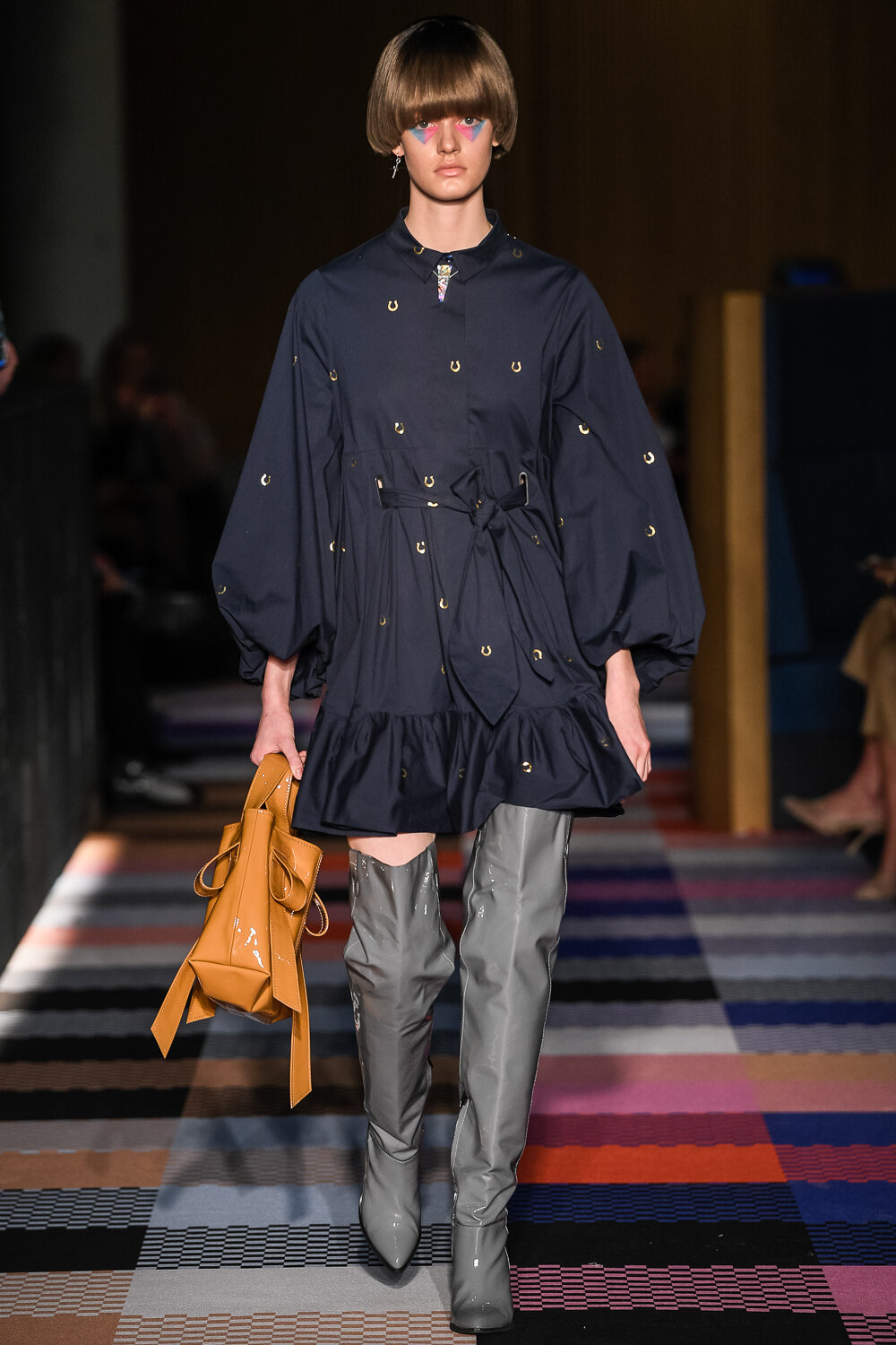
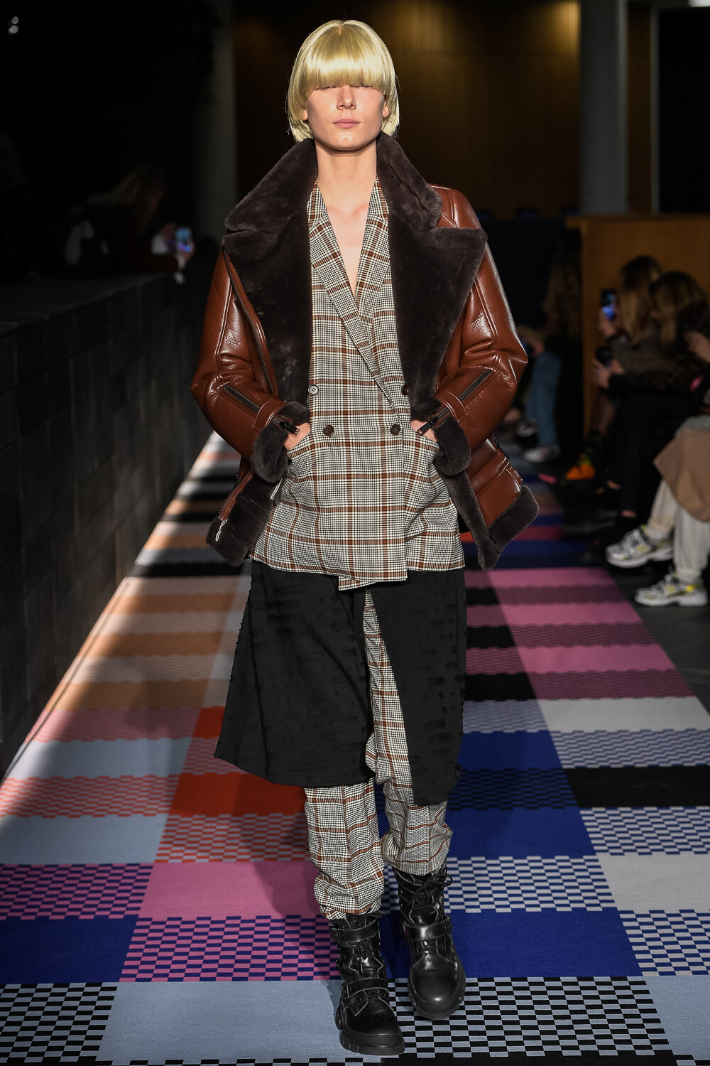
The Design School Kolding's Graduate show is always a solid indicator of where fashion is moving in Scandinavia. This year was no different. Among the plethora of design school graduates, nine of the designers were picked to show their work. And none of them failed to deliver.
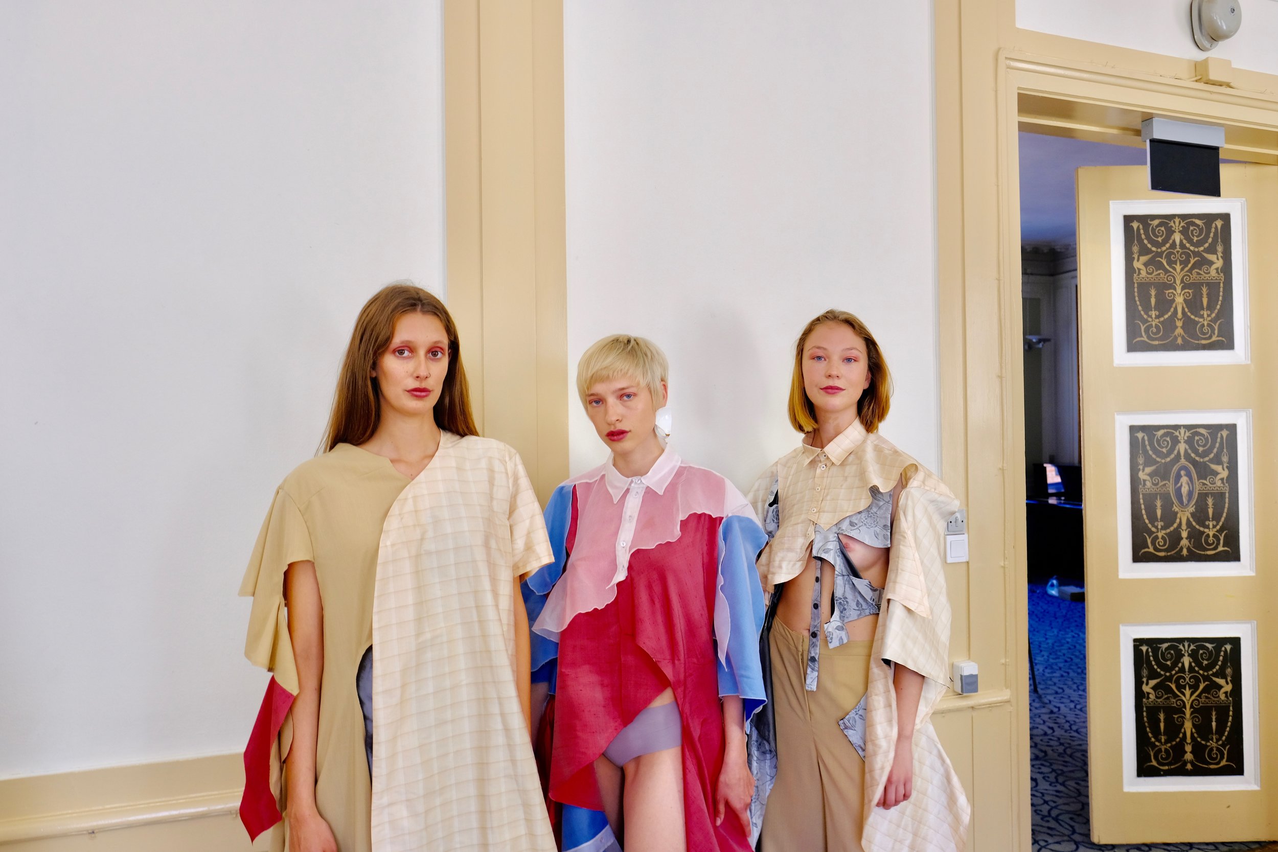
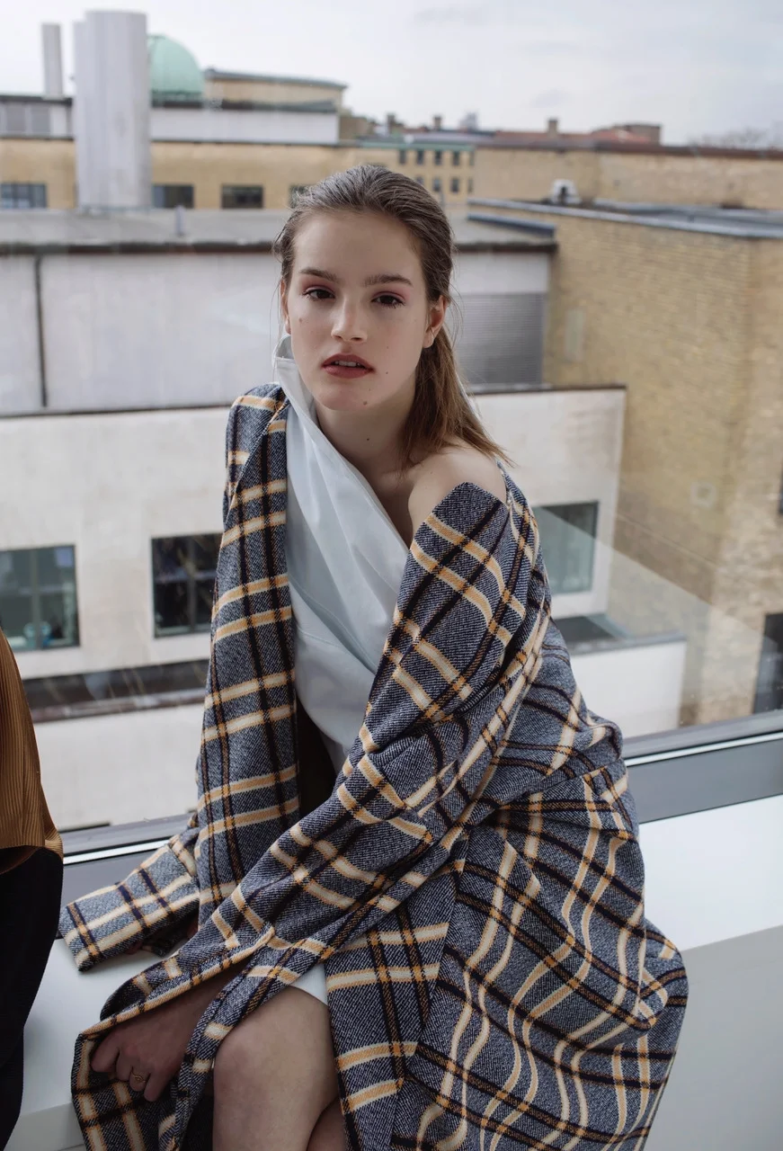
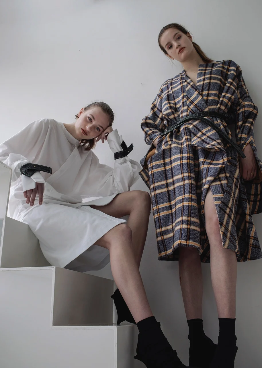
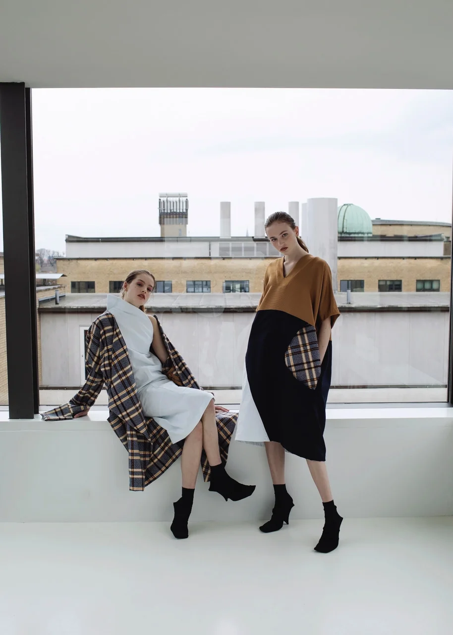
The designer duo Marie Due and Karoline Heide designed a collection using the bricolage method, where you make use of available materials, combine it in new ways to create something new. Such innovation is usually what draw crowds in Scandi markets but the aesthetics of their work would draw crowds outside of it. They used secondhand materials and thereby extended the objects lifecycle by using them within a different context with a clear understanding of deconstructed aesthetics.
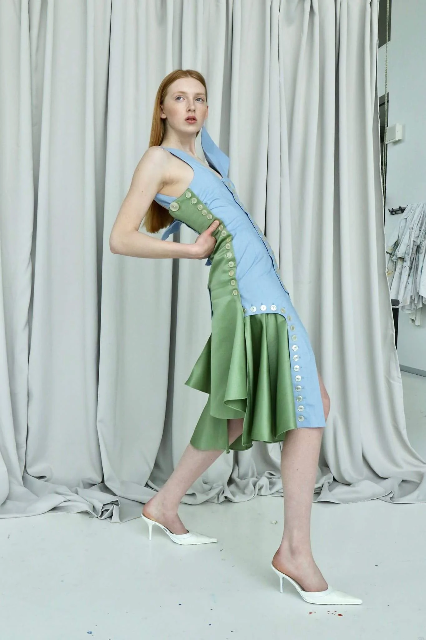
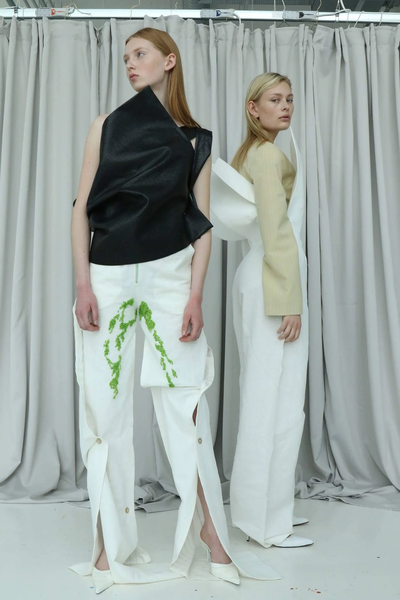
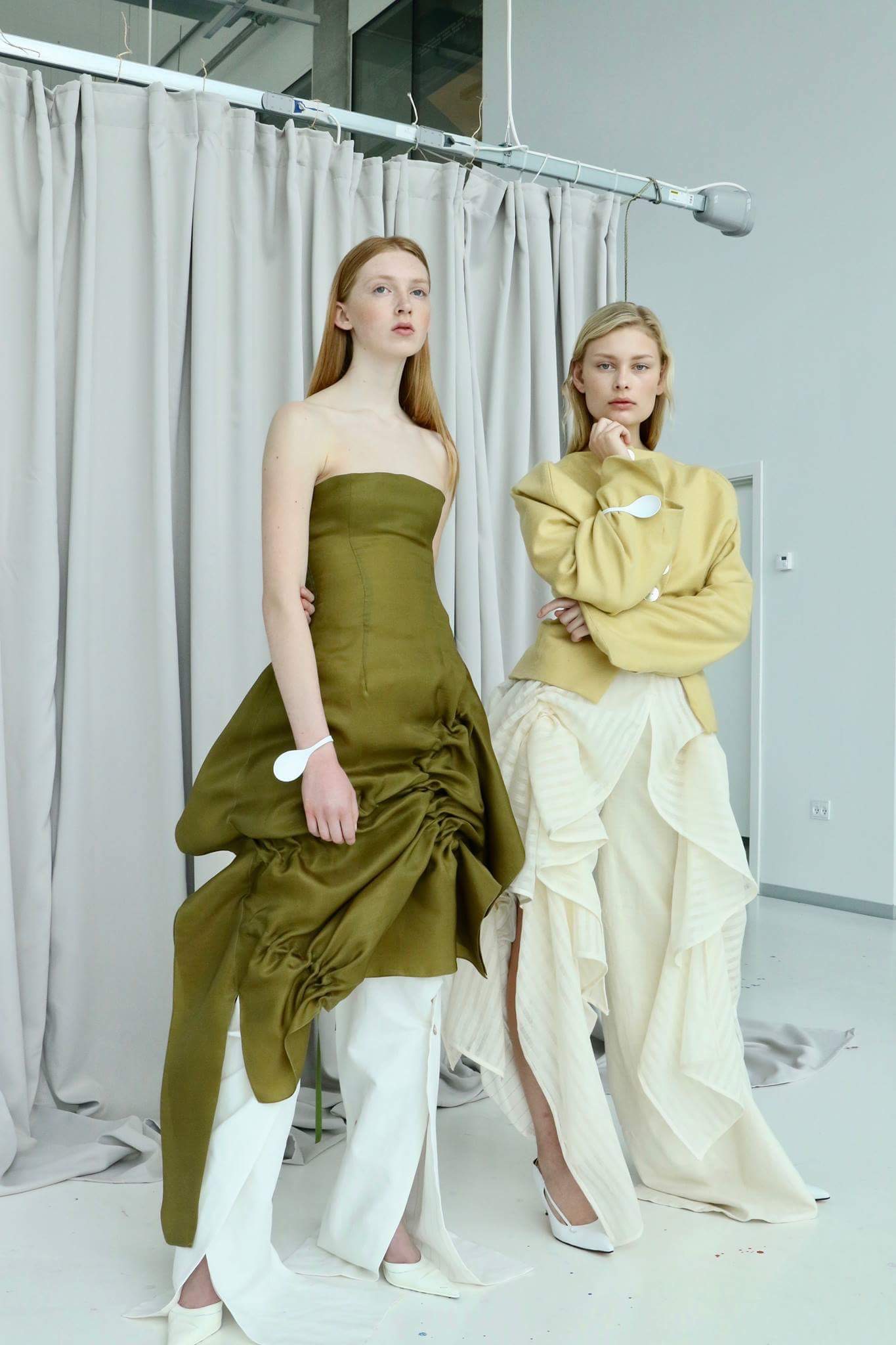
Alix Habran Jensen was inspired by forced marriages and the restrictions versus freedom on women's' bodies. It stems from his experience talking to victims of forced marriage and his work provided glimpses of what a designers role is in a rapidly political environment...that is to provide solution not only to aesthetics but also to certain social dilemma. The beautiful drapes on the white set with the yellow jacket and the green dress provided a fashionable and timely representation of where we are as a society.
Oliver Oppermann was inspired by one of the biggest problems for Danish teenagers, loneliness, which is an important topic for people in all ages. Oliver Oppermann worked with three concepts, modern living, social media, and loneliness and incorporated those concepts into his work.
Some of the designers also worked with the balance between gender and identity, like Sarah Sølver and Helene Stahl Holm.
Sarah Sølver's gender fluid collection was inspired by old tennis wear and provided a glimpse into retrofitting our sense of aesthetics through the lens of gender neutrality.
Helene Stahl Holm's collection about the empowerment of women stood out among this year's participants. Her insight into the ever demanding work place expectation for women to dress in a specific way was truly refreshing. She incorporated the strength of the man-suit in her collection, so women would feel strong and feminine at the same time without being sexualized or deemed a distraction. All in all Helene's work had elements of both masculinity and femininity playing off each other. It also had the most promising commercial appeal which tends to get pushed in the back-burner for a lot of creatives but ultimately is a very important component in finding a foothold in a very competitive market.
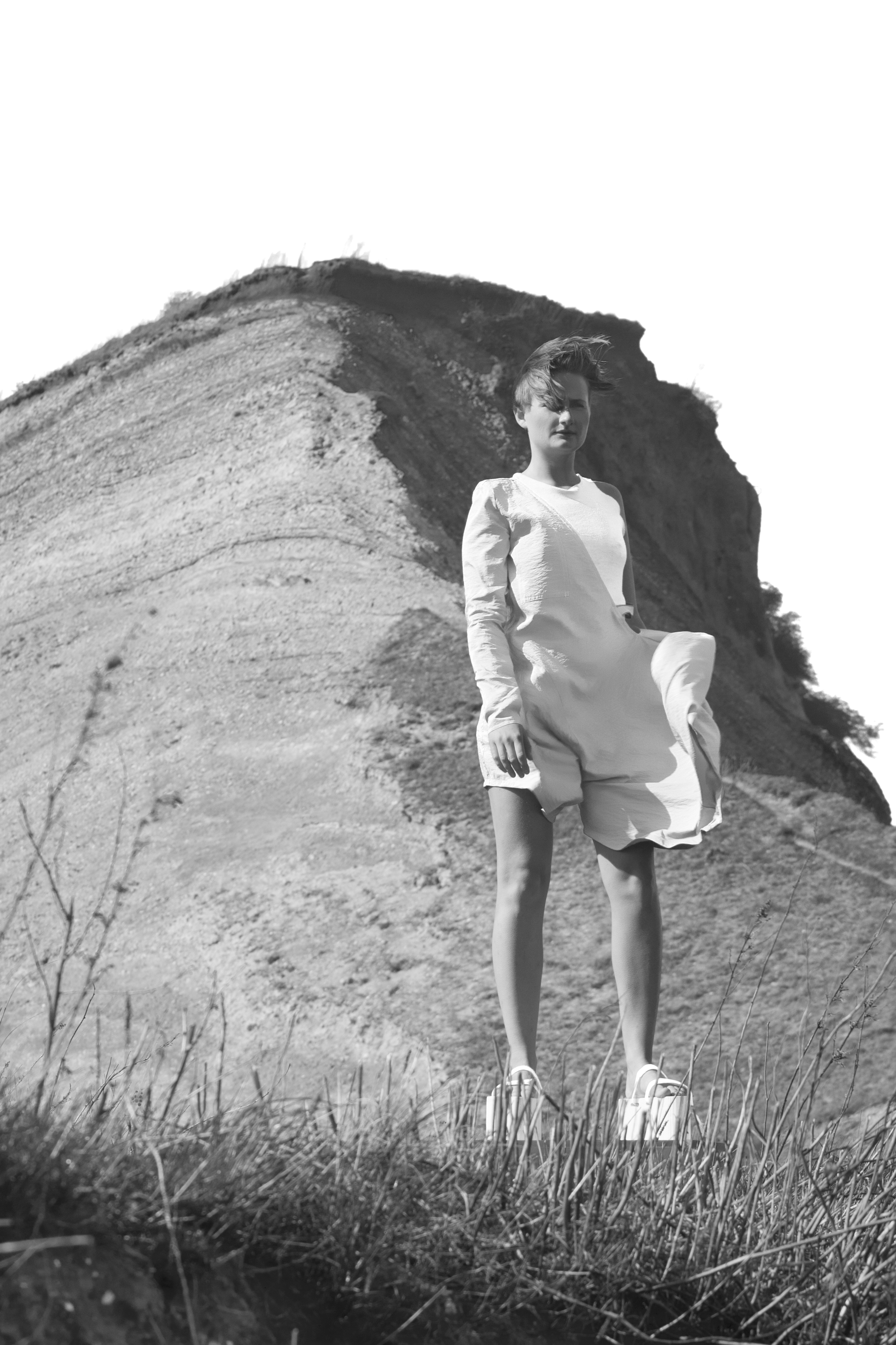
Sofie Bundgaard Holst worked with her own heritage to make slow aesthetic. She worked with the landscape of the danish island Mors, workwear details, controlled chaos by artist Eric Heide’s home, abstract sculptures, and the monochrome color palette to create workwear, casual wear and formal wear.
Michelle Brandstrup made a collection for the more reduced and flexible wardrobe. She also played with the boundaries between casual and formal wear.
Sofie Pazdecki wanted to explore the gender constructions and a more nuanced feminine aesthetic based on Sofie Coppola´s version of girly femininity in the movie ”The Virgin Suicides” from 1999. Her goal was to use the feminine aesthetic as a method to question and criticize the reaction from the outside world, objectification of women, and the stereotyped qualities associated with conventional feminine aesthetics.
In the end, the DSK show came across as a far more polished show than most other design school shows because the organizational skills and the aesthetic being presented complemented each other. It would not shock any of us , if one of these designers go out and change the way we view our everyday lives.

